

Kalon is a branding and packaging passion project, in protest of the “war-paint” standards that plague the men’s makeup industry. I believe makeup should be gender-inclusive, and that any person should have access to it.
Ideation
Kalon is a Greek word meaning “the ideal of beauty, especially moral goodness or nobility”.
This brand inspires men to embrace their inner and outer beauty.
A step beyond that, Kalon encourages them to use makeup to enhance and express that beauty.
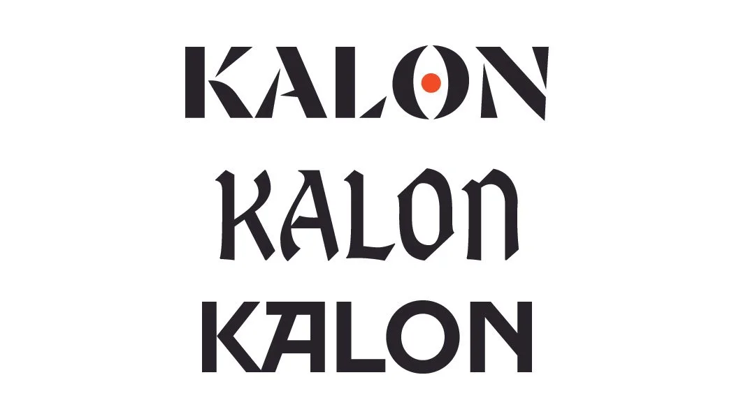
My logo concepts surrounded the idea of strength, clean design, and “shattering” the beauty standards.
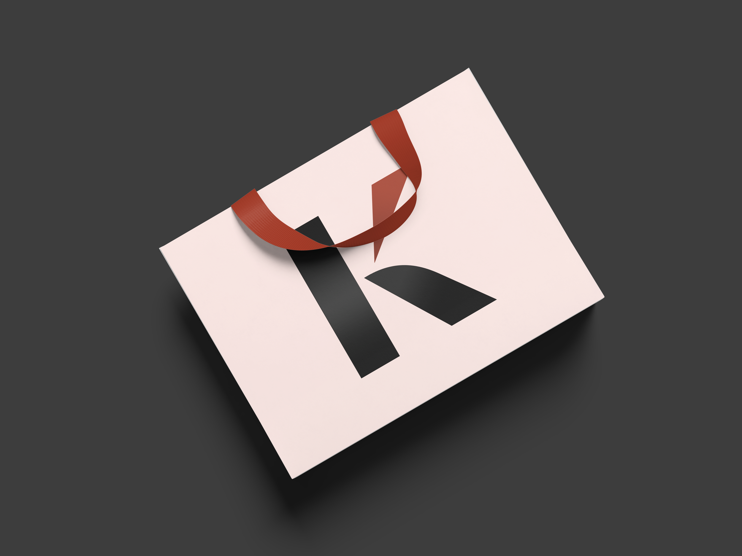
The “K” in the final logo represents shards of glass. It is a metaphor about breaking the barrier between kitschy men’s makeup brands and what customers actually desire.
The shade of orange I chose as the accent color is a terracotta. As a warm, stable color, it is a signal to customers that Kalon is a brand they can trust.
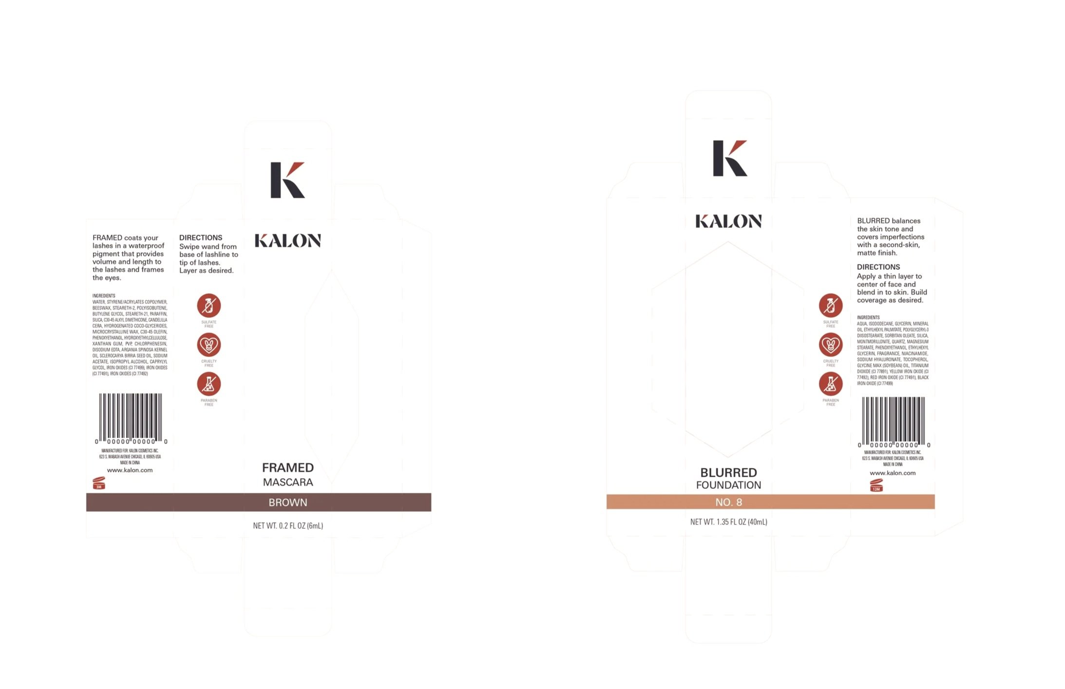
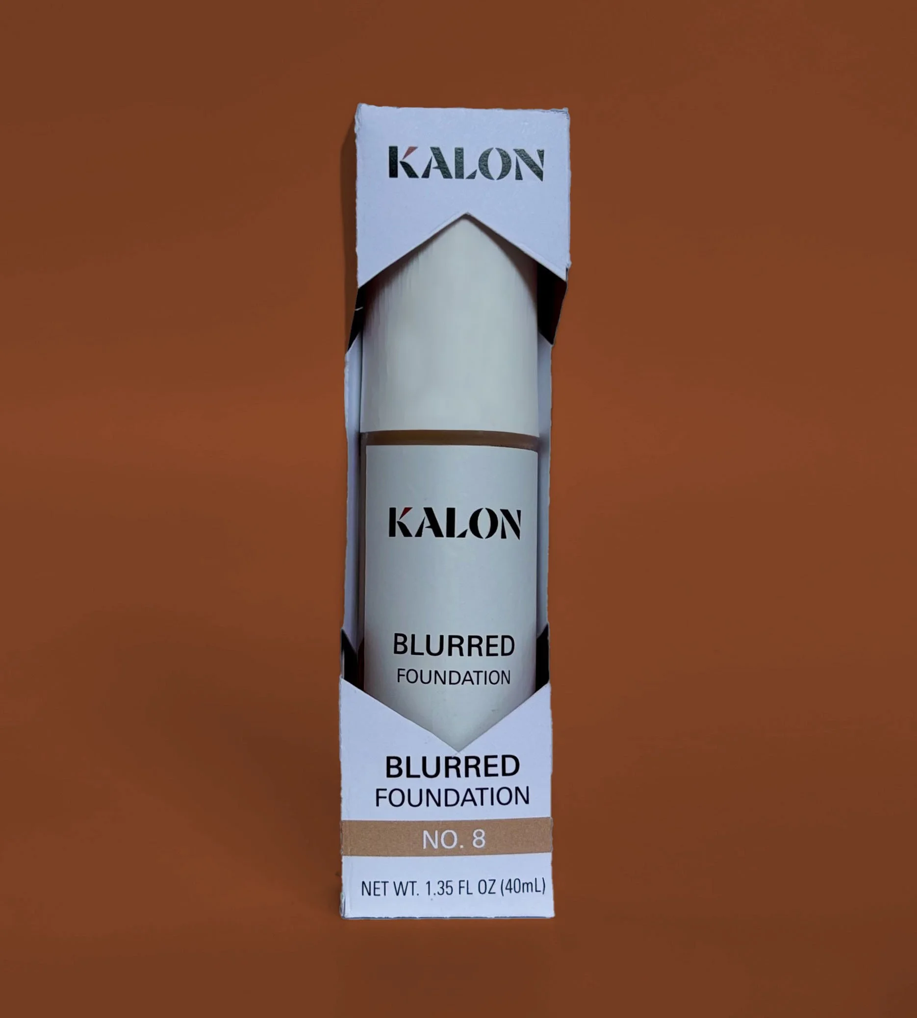
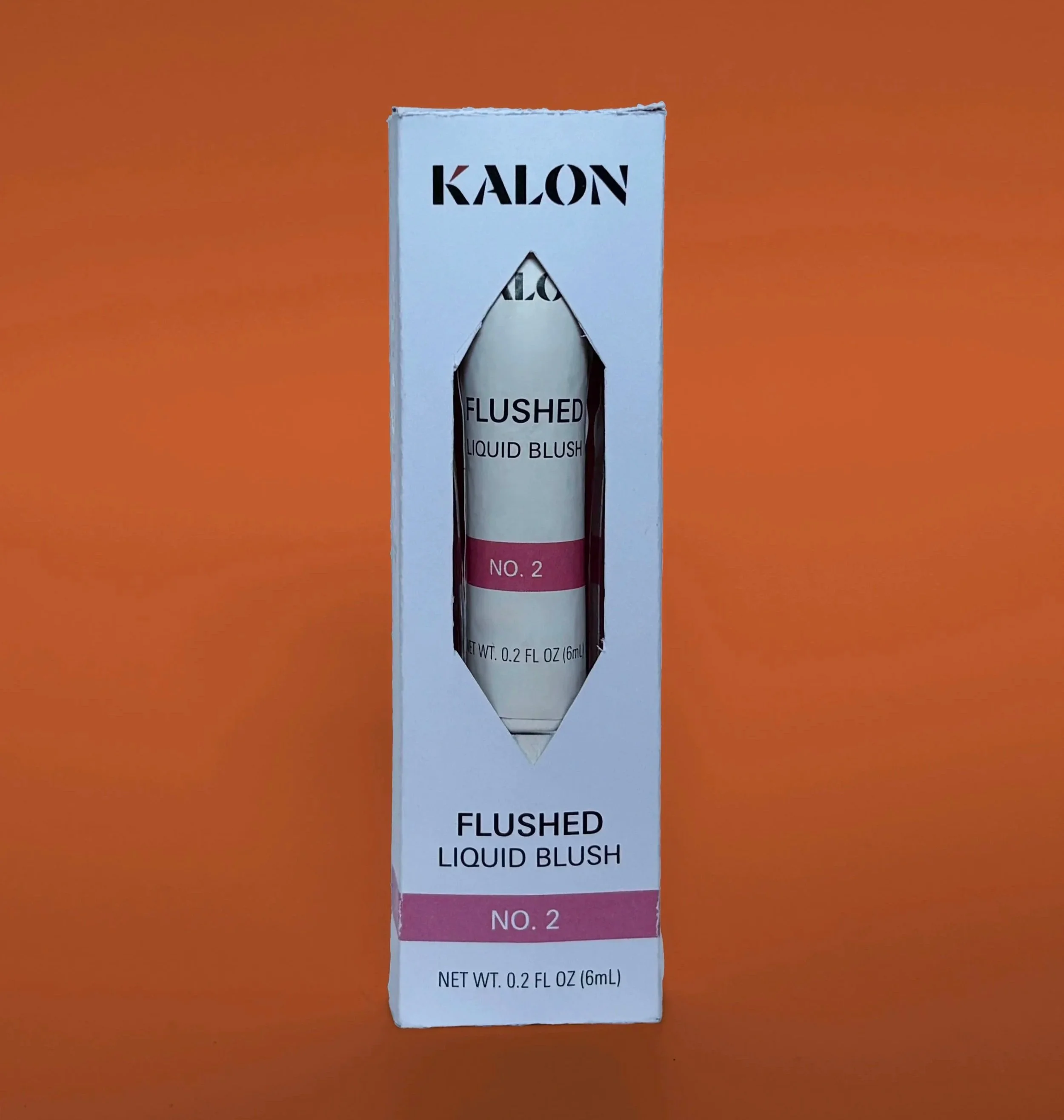
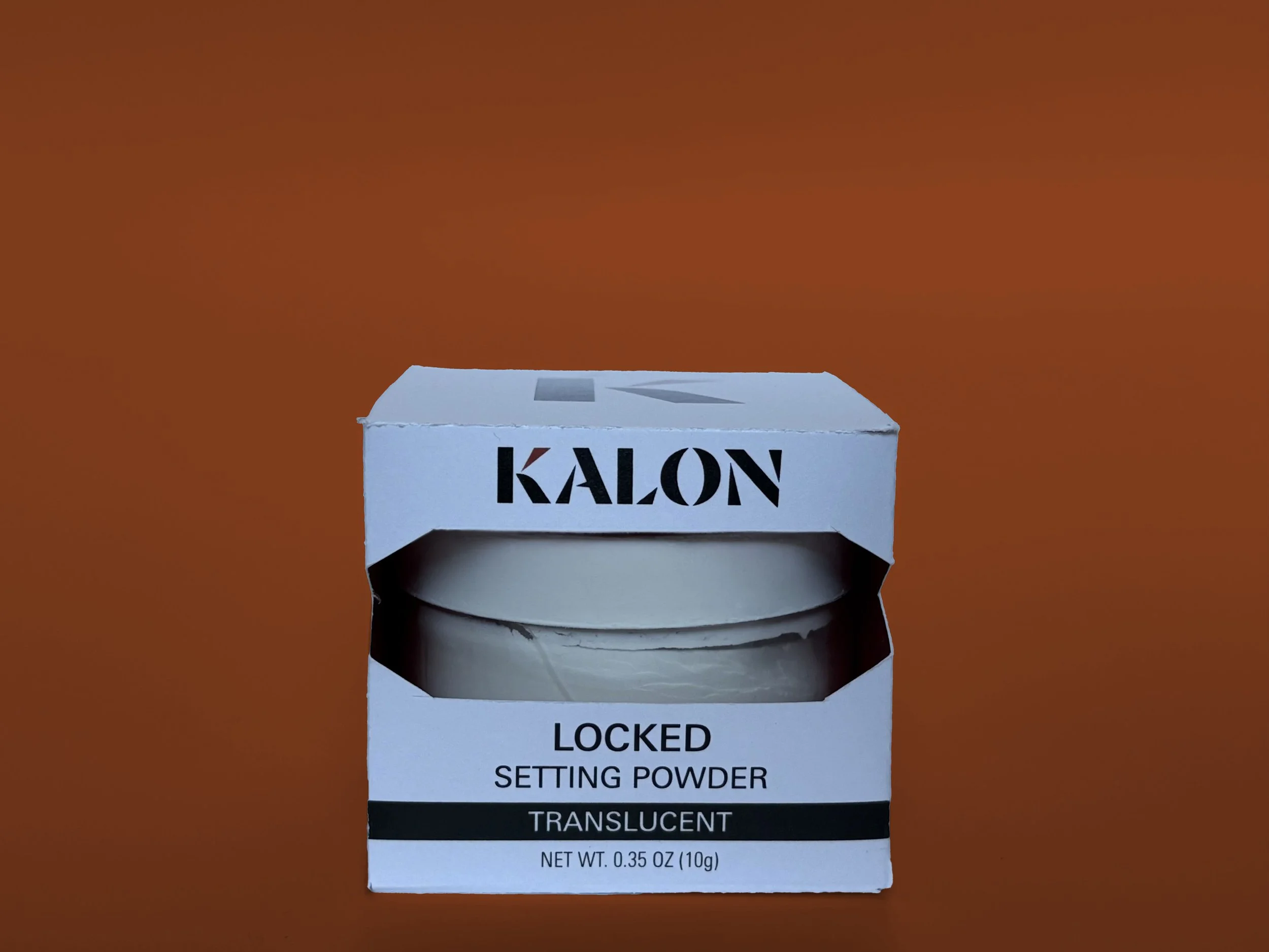
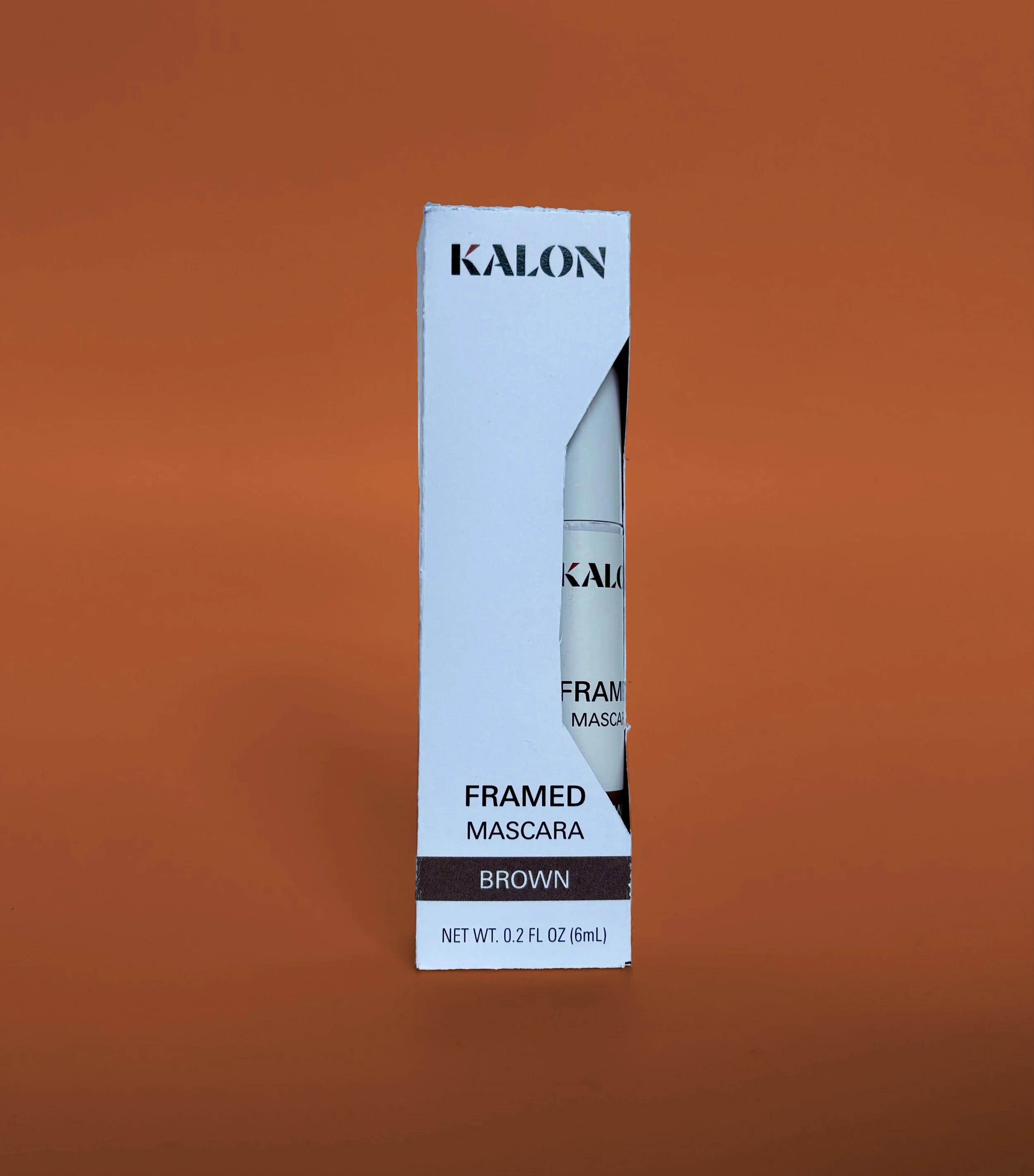
In order to design the packaging for the product series, I bought and studied several different makeup products. I chose five classic makeup products that are easy to use. The goal was to make each product simple, with clear use guidelines on the side of the packages.
Then, I sanded and painted each product I chose to match Kalon’s identity, since I cannot produce my own containers or jars.
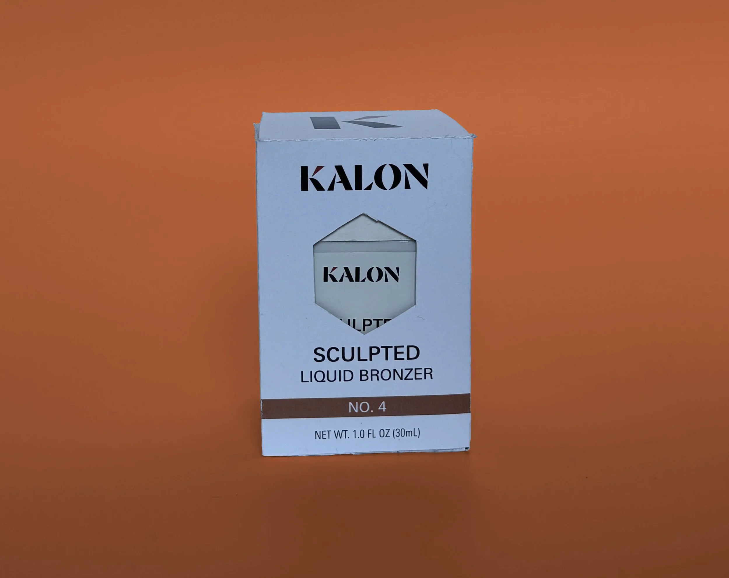
The packaging die lines and product labels were designed from scratch. Each package features a die cut that showcases the product and matches the “shattered glass” motif in the logo.
The finished packaging series mockups are shown below. They were printed and photographed using materials available at my college.
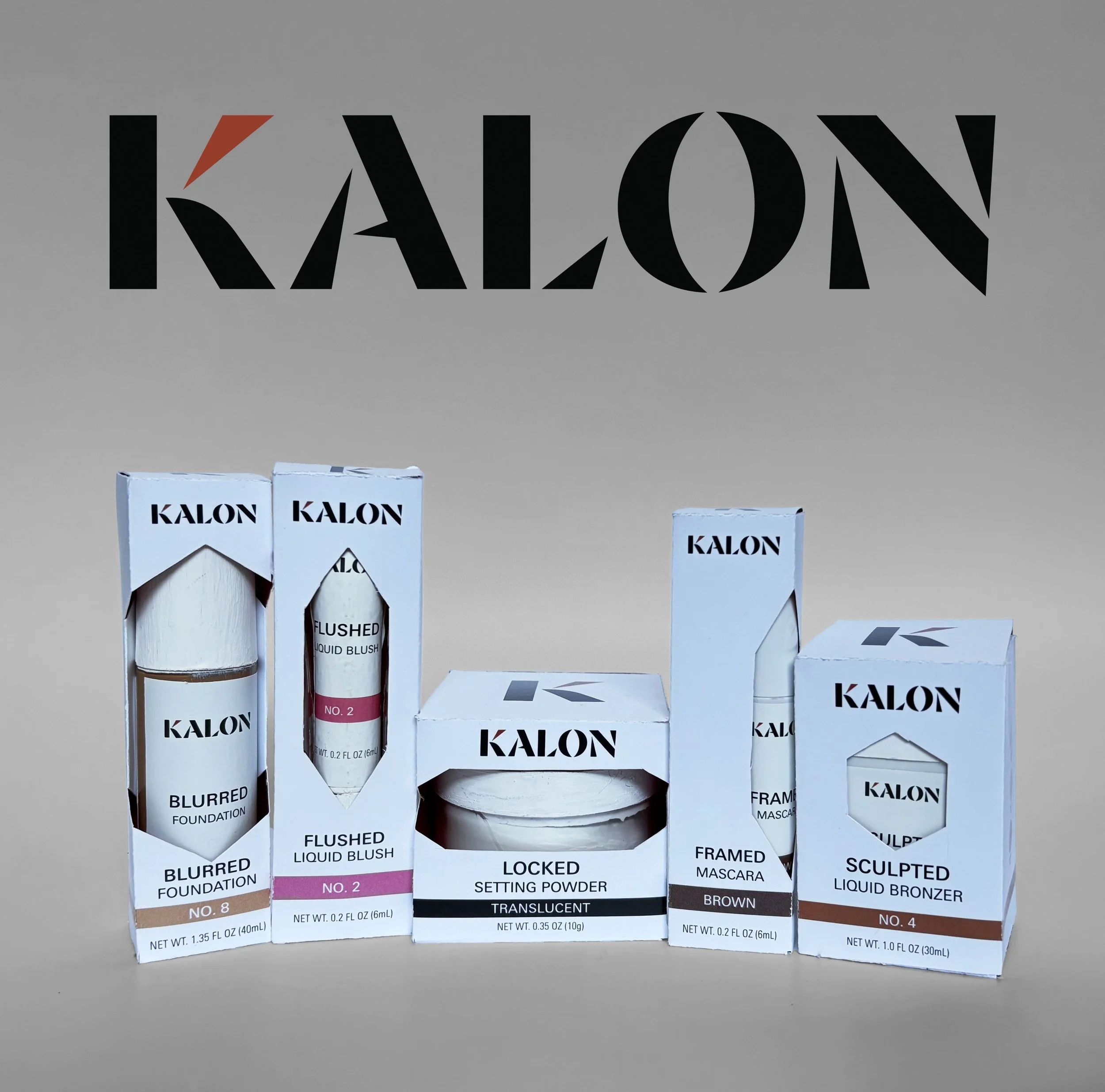
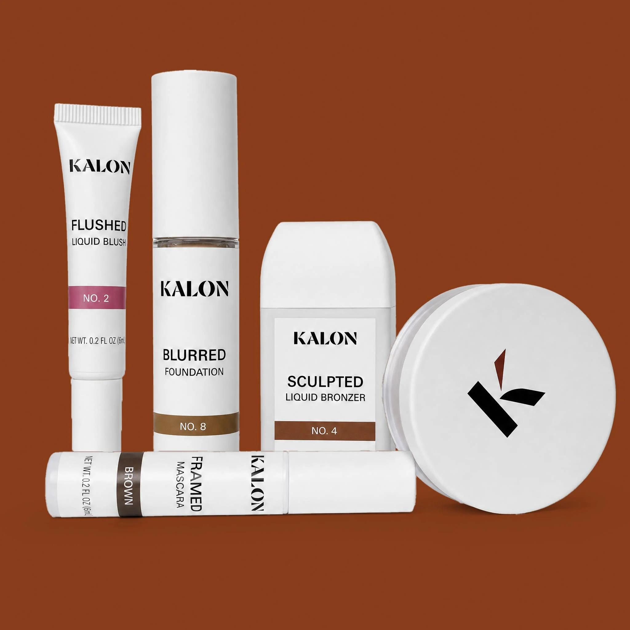
Kalon Product Series:
BLURRED Foundation
FLUSHED Liquid Blush
SCULPTED Liquid Bronzer
FRAMED Mascara
LOCKED Setting Powder
Kalon products are numbered so that finding the correct shade is less of a guessing game.